蝉知系统导航栏子导航如何横向排列
- 2016-08-01 10:47:00
- GavinHsueh 原创
- 13359
导航对于一个站点来说起着至关重要的作用,通过导航条可以提高用户体验,迅速找到目标内容,同时对于搜索引擎而言有利于抓取网站子页面内容。但有时我们为了导航条的美观,需要对其多一些调整,下面我们来分享下 蝉知 企业建站系统的导航条如何设置子菜单横向显示:
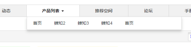
方法一:调整默认CSS样式:
在设计--代码管理---全部页面---CSS中加入下列代码:
.dropdown-menu li{
    float:left;
}
.dropdown-menu{
    min-width:500px;
}
看下效果:
方法2:自定义区块
我们也可以根据自己的需求自定义一个导航区块,比如我们新建一个自定义区块,HTML,CSS,JS代码分别下:
HTML:
<script type="text/javascript" src="images/jquery.js"></script> <div class="container"><div style="clear:both;display:block;padding-bottom:20px;"><ul id="topnav"><li><a href="">Home</a></li> <li><a href="">About</a> <span> <a href="">The Company</a> | <a href="">The Team</a> | <a href="">Careers</a> </span> </li> <li><a href="">Services</a> <span> <a href="">What We Do</a> | <a href="">Our Process</a> | <a href="">Testimonials</a> </span> </li> <li><a href="">Portfolio</a> <span> <a href="">Web Design</a> | <a href="">Development</a> | <a href="">Identity</a> | <a href="">SEO & Internet Marketing</a> | <a href="">Print Design</a> </span> </li> <li><a href="">Contact</a></li> </ul> </div> </div>CSS:
#blockID{
    margin:0px !important;
    padding:0px !important;
}
#blockID .panel-body,#blockID .container{
    padding-left:0px !important;
    padding-right:0px !important;
}
body {
	font: 10px normal Verdana, Arial, Helvetica, sans-serif;
	margin: 0;
	padding: 0;
}
.container {margin: 0 auto;}
ul#topnav {
	margin: 0; padding: 0;
	float: left;
	width: 100%;
	list-style: none;
	position: relative;
	font-size: 1.2em;
	background-color:black;
}
ul#topnav li {
	float: left;
	margin: 0; padding: 0;
	border-right: 1px solid #555;
}
ul#topnav li a {
	padding: 10px 15px;
	display: block;
	color: #f0f0f0;
	text-decoration: none;
}
ul#topnav li:hover { background-color:blue;}
ul#topnav li span {
    z-index:999;
	float: left;
	padding: 15px 0;
	position: absolute;
	left: 0; top:35px;
	display: none;
	width: 100%; background: #1376c9;
	color: #fff;
	-moz-border-radius-bottomright: 5px;
	-khtml-border-radius-bottomright: 5px;
	-webkit-border-bottom-right-radius: 5px;
	-moz-border-radius-bottomleft: 5px;
	-khtml-border-radius-bottomleft: 5px;
	-webkit-border-bottom-left-radius: 5px;
}
ul#topnav li:hover span { display: block; }
ul#topnav li span a { display: inline; }
ul#topnav li span a:hover {text-decoration: underline;}
JS:
$(document).ready(function() {

$("ul#topnav li").hover(function() { //Hover over event on list item
	$(this).css({ 'background' : '#1376c9 url(topnav_active.gif) repeat-x'}); //Add background color + image on hovered list item
	$(this).find("span").show(); //Show the subnav
} , function() { //on hover out...
	$(this).css({ 'background' : 'none'}); //Ditch the background
	$(this).find("span").hide(); //Hide the subnav
});

});
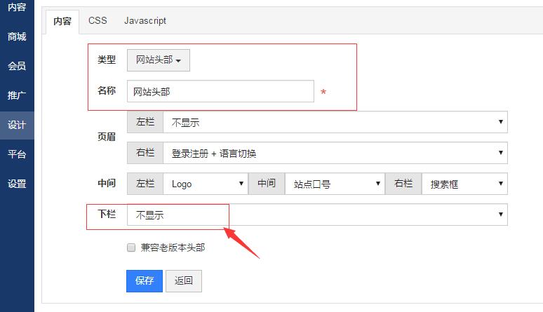
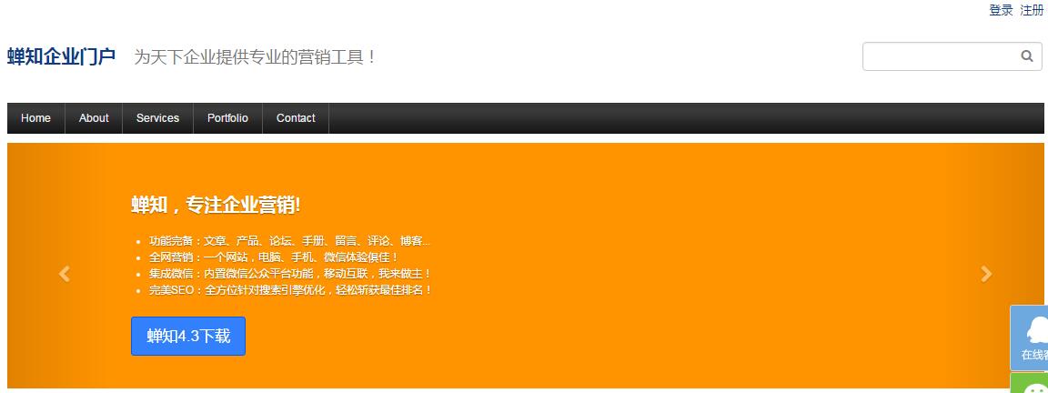
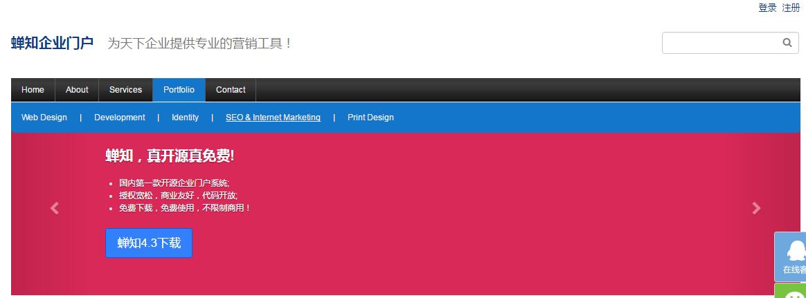
然后布局到全部页面的页头即可,同时将网站头部区块的下栏设为不显示,即去除蝉知自带的导航栏。我们来看下效果: